Tuesday, 26 March 2013

Development of Final Collage


Final Collage:


I have added the caption 'Osborne's Paradise?', because George Osborne is the chancellor of the United Kingdom, and therefore responsible for the county's economy. I thought that because of how Osborne has caused the closure of many businesses, this may have been his plan, and wants Britain to fall into a deep state of depression. Also, the word 'paradise' links with somewhere you enjoy being (Osborne may enjoy being in a failing country?), and also to the palm trees which I added using block prints.


Overall, after the enhancement on Photoshop, I think my Collage is quite effective. It attracts attention due to the deep colours and use of blank space. Also, the use of ink spillages around the photos adds to the sense of disarray- making the collage appear old and dark.


Alternative Idea:
 
 
In order to develop this idea, I took more photographs. I have aimed to give the collage a less serious theme while still appealing to the phrase 'it's the end of the world as we know it'. This time I used digital techniques (i.e. altering the threshold and contrast), and I put the photos together using Photoshop. This was much easier as I could alter the size and location of the images whenever necessary.
 
 
The crude effects implemented on the background photographs are supposed to amplify the neglect and decimation of the scene, and make the photographs appear as if they have been photocopied. The addition of the seagulls creates a story, and makes you question why they are included (did they cause this destruction?). Also, the way they appear to be looking at the viewer gives a sinister edge to the collage.

Collage Using Magazines

Magazine Collage
 
Enhanced Collage

Thursday, 21 March 2013

My Collage- Photographs


IT’S THE END OF THE WORLD AS WE KNOW IT

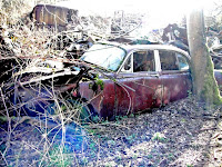
I have chosen to base my collage on the theme ‘It’s the end of the world as we know it’. I have interpreted this as the stagnation of the British economy, and have decided to photograph derelict factories and businesses. I think this represents my chosen theme, as it shows that change is rapidly taking place in our country- the closing of businesses means a loss of jobs, therefore meaning a change in the livelihood for a large amount of people (hence, it’s the end of the world as we know it). It also shows how Britain- the leading country of the industrial revolution- is falling out of favour, and is sinking into a deep depression- affecting the people who live in this country in a negative way.


Enhanced Images: For this next set of images, I wanted to accentuate the decay and neglected sense of the photographs. I did this by enhancing the colours, which helps to make things such as moss and rust stand out. This adds to the sense these objects have been here for a long time. I think this acts as symbolism, as Britain’s industrialised economy has been here for a long time, and is experiencing decay and stagnation, much like the vehicles photographed. Adding further to the irony, these vehicles were produced in the UK, symbolising the bad condition the manufacturing industry is currently in.


Collage Artist- Richard Hamilton

Richard Hamilton

Interior II (1964)
Richard Hamilton was a British painter and collage artist, and is thought to be one of the founders of the ‘Pop art’ movement.
His piece ‘Interior II’ stood out to me the most, compared with his other works, because of its simplicity and effective use of blank space. I like how a seemingly normal-looking interior has been created using lots of individual images- it isn’t until closer inspection when you become aware of the peculiarity of it. The combination of textures and colours gives variety, making it pleasing on the eye, and interesting to look at- the light wood grain on the wall and floor-boards in the foreground contrast with the flat colours surrounding the rest of the room. However, through the archway, another, more detailed room can be seen. The musty wall behind the woman adds perspective and depth to the piece, as does the dark-coloured floor and array of furniture. The cutout of the woman is where my eyes are immediately drawn. I think this is because she doesn’t seem to belong there- the room is full of bright, flat colour, whereas she is in monochrome, and has a vast amount of shadowing and detail. This may have hinted at how the design of the home was progressing much faster than personal fashion (i.e. clothing) of that period.
I would like to base my final collage upon Hamilton’s style- hopefully retaining the sense of simplicity, but also providing a powerful composition which sparks questions and curiosity.

Diane Arbus, Harold Edgerton- Brief Analysis

Diane Arbus: Identical Twins, 1967

At first glance this photograph appears crude and imperfect. The skewed angle of where the bricked-floor meets the wall, and unusual expressions on the girl's faces make the photo appear as if it was taken in a hurry. However, on closer inspection, it is clear this was intentional. The way one sister has a faint smile, and the other a frown shows the differences between their personalities- even though they are dressed the same, and have the same physical features, their minds are completely separate.
Vague Interpretation:
The girl on the left may appear unhappy as she is frustrated with being dressed to look identical to her sister, and consequently being made to abide by the stereotypes of how identical twins should appear. In addition, the girl to the right may seem happier, as she may enjoy attention from the camera and may be more comfortable with the choice of clothing- this further differentiates the two, as this may not be how the left twin likes to dress every day, for example.

There also seems to be a slight awkwardness to the photo. Both girls are standing in close proximity to one another, and have very straight, unnatural posture with their arms pointing straight to the ground. Therefore, it is clear this photograph was choreographed, but was made to appear accidental. Although, I believe this was Arbus’ aim- I suppose Arbus may have taken inspiration from the array of awkward family photographs documented at that time.


Two years before receiving her first camera, Diane Arbus wrote:  
(1) "There are and have been and will be an infinite number of things on Earth. Individuals all different, all wanting different things, all knowing different things, all loving different things, all looking different. . . . That is what I love: the differentness.”
 I think this statement is strongly represented in this photograph. I believe she tried to show that even if two individuals look similar, they have hugely different personalities.

On reviewing Arbus' work, art blogger Robert Nelson of 'The Age Australia' was highly critical, stating:

(2) "The prints are overwhelmingly dull, almost grubby. Black and white photography can easily achieve luminosity, because the paper is naturally bright and light-catching. But Arbus kills this either in her negative or her printing (probably the latter) to leave us with grey highlights and an overall leaden quality, visually unrewarding and depressing"
Although I can understand his point of view, I believe the lack of luminosity works well, as I find that your eyes are drawn directly to the girl's faces. The crudeness of the printing makes the photograph appear eerie and home-made, giving the impression the photographer wanted to emphasise the imperfections and make them instantly noticeable (without being distracted by a glossy finish).


Harold Edgerton: Bullet Through Apple, 1964

Of all of Edgerton's photographs, this composition is my favourite. This is because the photo misleads you- by this I mean it looks simple and natural, completely belying the amount of technology and effort required to make this image possible. The main reason for this is the lack of blur- the crispness and detail of the photograph makes the whole scene appear stationary. I also like the use of contrasting colours; the red of the apple and blue of the background complement each other, giving a bold and modern character to the piece. In addition, the balance of the photo is almost perfectly central, as the bullet and apple reach over the same distance from the edges of the work. Furthermore, this photograph has a strong educational value, as it shows you how objects react when a fast-moving bullet is fired through them (i.e. liquid from the apple is forced back in the direction the bullet travelled from).

Photographer- Ansel Adams


Ansel Adams
Ansel Adams (February 20, 1902 – April 22, 1984) was an American photographer. He is best known for his black and white landscape pictures of the Western United States. He began taking pictures at the age of 14, establishing his lifelong interest in the recording of nature. One of his favourite locations to photograph was the Sierra Nevada, which also happens to be where his most successful and renowned photographs were taken. This is partly due to his establishment of the Sierra Club- which helped to conserve national parks such as the Sierra Nevada mountain range. It is thought Adams’ main influence was Paul Strand, who was one of the first “straight photographers”, which means that he developed his photographs in a particular way to ensure they look as realistic and clear as possible- creating the impact of a piece of art.

(1) “Everything I have done or felt has been in some way influenced by the impact of the natural scene”

 
Road To Nevada
The darkness of this photograph makes a strong impact, and giving a sense of depth and perspective. The brighter colour of the road helps it to stand out, making it the focal point of the composition. I also like the detail and textures of the road surface. The bright white of the road markings divides the image through the centre, and helps you to distinguish the image is of a roadway. Also, the way the road travels up the mountains in the distance gives the impression that Adams was on an adventure, and took a photograph of the location he wanted to get to. The overall darkness of this piece adds mystery as it is unclear what is situated either side of the roadway.
 
Winter Sunrise, Sierra Nevada from Lone Pine
I think the composition of this image is very effective. I like the way the image has horizontal layers of light and dark grey- with the bright mountain peaks being the principal area of the composition. Also, the dark hill towards the foreground adds a sense of secrecy, as it is unclear what could be lurking on it- giving a feeling of depth and meaning to the photograph. The low clouds add height to the mountain range, making them appear more intimidating. Also, the ridges and caves shadowed on the mountain range could be perceived as being scars- showing how this landmark has weathered many of the earth’s changes, displaying how ancient it is. I think the story behind this image is related to conservation. The lack of human presence in the image shows how beautifully natural this mountain range is- potentially encouraging people to help with the conservation of the site. Also, Adams’ love of nature was the main source of the photograph- helping him to capture an un-spoilt and striking photo of the mountain range.
Farm workers and Mt. Williamson
This photograph seems to show the contrast of human-managed land (the field), and earth-managed land (the mountain range). The field appears very neat and controlled, with straight parallel lines running towards the mountains. In contrast, the mountains seem to be more erratic, with deep crevasses and scars covering the whole of the landform. I think this image shows how much of an influence we have over the earth, as our influence can be seen almost anywhere. However, I am unsure whether Adams saw this as a positive thing- he was an avid naturalist, and believed in protecting the earth’s natural beauty- something which farming does not. Although, in my opinion, this image appears to show progress in a positive way- both in the short term (the transformation of the land as the yield is harvested) and long term (the transformation of the land to benefit people)- as it shows people working together to achieve something beneficial to others, and what can be achieved in a relatively short amount of time (in comparison with the mountain range, which may have taken millions of years to appear as it does in this photo).
 
 
I think this photo shows happiness and satisfaction. I believe this because this farm worker is holding two large, healthy-looking cabbages- hinting at a successful and high yielding harvest. The clarity and simplicity of the composition helps the observer to see every detail, improving the understanding of what the photograph is of. I think the lack of colour photography during Adams’ period must have made it difficult to produce images which were clearly recognisable in black and white. However, it is clear he has used other techniques to compromise- by using natural light to illuminate the whole subject, every shape is visible, helping the observer to understand what the photo is depicting. Also, the limited amount of shadowing further boosts its clearness. 

Although Adams was a hugely successful and popular photographer, he struggled to attain approval from critics. Brian Sewell of the London Evening Standard wrote:


(1) "I have no difficulty in agreeing that Adams is among the greatest of landscape photographers"

but continued by stating:

(1) "Hubert Ponting and Frank Hurley had far outdone him in their work"

Both of these photographers are much less well known than Adams, meaning Brian Sewell may be implying that he is not deserving of his success.


Hubert Ponting


Frank Hurley

(1) http://www.standard.co.uk/goingout/exhibitions/ansel-adams-photography-from-the-mountains-to-the-sea-national-maritime-museum-se10--review-8297082.html
 

History of Lens Based Image Making- Monochrome and Colour Processes

History of Lens Based Image Making

Early developments of the Monochrome Process:

·         Thomas Wedgwood- the first person to develop a method to copy visible images chemically, to produce permanent media.

·         Wedgwood began experimenting with photography around 1790. He devised a method of staining an object’s silhouette to paper.

·         First of all, he coated the paper with silver nitrate, and then placed an object on top. He then exposed the paper to natural light, and was then preserved in a darkroom to develop.

·         This method was published in ‘London’s Hournal of the Royal Institution’ in 1802 by Humphry Davy.

·         The earliest photograph of people is Louis Daguerre’s ‘Boulevard du Temple (1838). However, because the exposure time was ten minutes, fast moving objects (such as vehicles and walking people) were not stationary long enough to be captured. A man having his shoes polished by another man are the only visible people in the photograph:

inventors.about.com
 
 Early developments of the Colour Process:

·         Colour photography was explored throughout the 1800s, although, throughout the early stages, these photographs were projected temporary images.

·         In the 1870s, emulsions sensitive to red and green light became available.

·         In 1861, the first colour photograph was taken by James Clerk Maxwell of Scotland. It was an image of a tartan ribbon:


History of Lens Based Image Making- The Camera Obscura


History of Lens Based Image Making
Photography took many years and many different people, from around the world, to develop into a substantial process.

The Camera Obscura
 
 
Aristotle, a Greek philosopher (4BC), found that a sunbeam shining through a small hole in a darkroom’s wall, would project an image (of the view outside the hole) onto a surface. The image is exactly to scale, and includes all of the same colors, but is upside down.
Glasses were a crucial invention, and are known to have been invented during the 1300s. Russian inventor Lomonosov then developed optics (such as fast lenses) from the technology discovered through the invention of glasses. This led to biconvex lenses being used in miniaturised camera obscuras (which were around 1m long). These smaller camera obscuras were used to trace real life objects- the picture was projected onto semi-transparent paper or opal glass at the back, through from the biconvex lens at the front. Mirrors could be positioned within the device to turn the image the right way up (as it was projected upside-down).
 Russian chemist Bestuzhev-Rjumin (1693-1766), and German anatomist J.H. Schulze (1687-1744) discovered how to transform an optical pattern (e.g. one on a camera obscura) into a chemical process in a light-sensitive layer. Whilst developing treatments in 1725, the pair noticed how iron salt solutions change colour when exposed to sunlight- marking the start of their photography experimentation.
It wasn’t until the beginning of the 19th century when scientists began intentionally working on chemical fixing of a camera obscura light image. Joseph Nicephore Niepce (1765 - 1833) and Louis Jacques Mande Daugerre (1787 - 1851) of France, aswell as Englishman William Fox Talbot (1800 - 1877), are the scientists known as obtaining the best results from these early developments, and are therefore recognised as the inventors of photography. The year of photography invention is considered to be 1839- where a photograph of a man in Paris was produced by Louis Daugerre (however there was no negative- meaning very few copies were produced).
Camera Obscura Diagrams and Pictures:
 
 
A drawing of a camera obscura, possibly comparable to one found during the 1300s.

 
Four Drawings representing Campo San Giovanni e Paolo in Venice. Produced by Canaletto, obtained using a camera obscura.

 An image of a modern-day camera obscura.

By the 18th century, smaller, more portable camera obscuras became available (around the size of a book). This made it easier for amateur artists to use them while on their travels.